ClearSpend
ClearSpend provides a streamlined solution that enables governments to share financials. It simplifies the complexities of transparency efforts, ensuring states meet mandates and public expectations for open governance. The visual identity was developed in collaboration with another designer. Since its launch, art direction has guided the creation of brand assets and marketing deliverables, ensuring consistency and alignment across all touchpoints.
The Brand
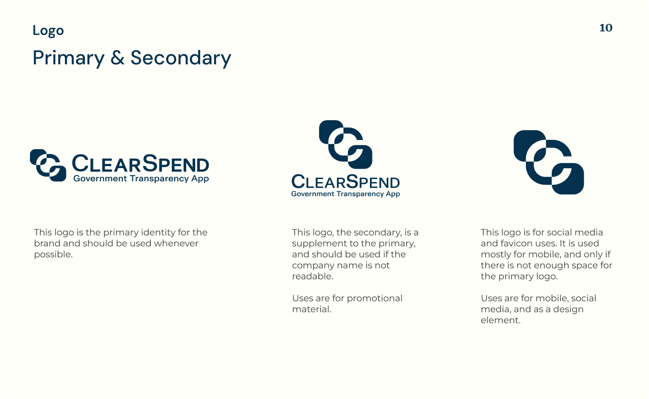
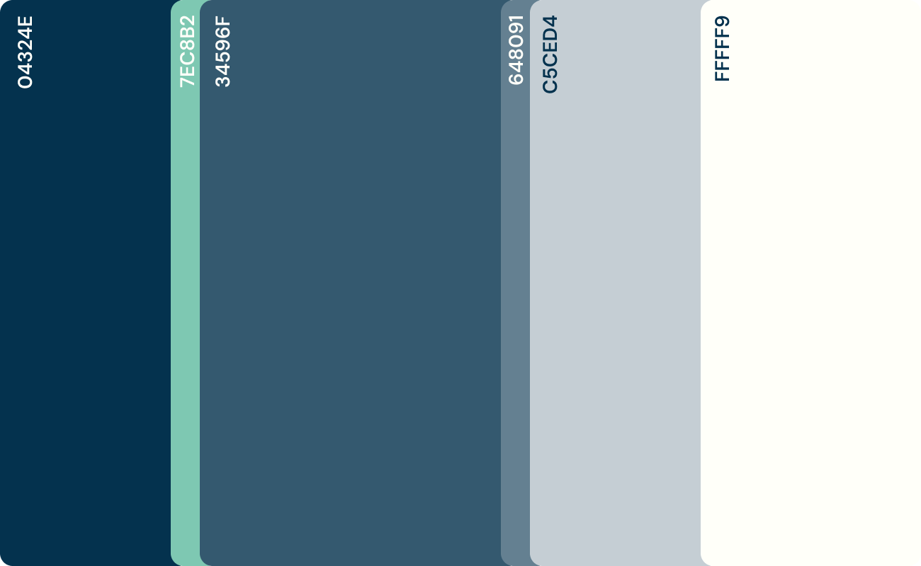
The ClearSpend brand prioritizes clarity, accessibility, and functionality. The logo is designed to be easily recognizable and legible across digital formats, supporting users who rely on the platform for court-related financial tasks. The color palette and typography were chosen for their associations with trust and transparency, helping to create a sense of reliability without unnecessary complexity. These visual elements work together to support a consistent user experience and reflect the software’s role in simplifying a traditionally complicated process.
Project Type
Branding
Marketing Materials
Digital Campaign
Process
First concepts
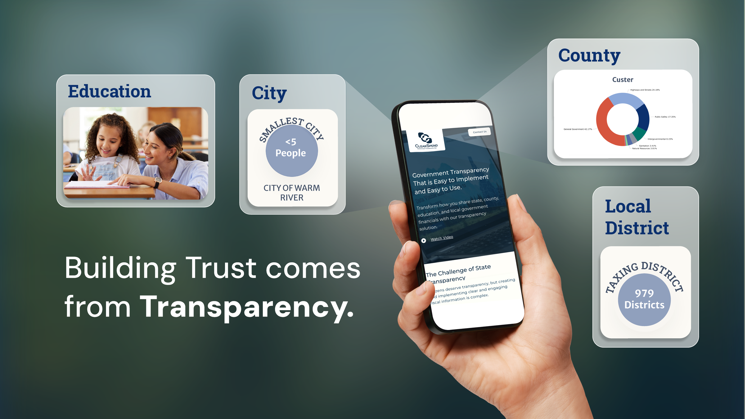
These symbols reference government iconography and emphasize themes of transparency, efficiency, and time-saving, all core offerings to the platform’s purpose of simplifying interactions with public systems.
Final direction
After further development of the brand, the direction changed to symbolize the squares of data being visible to the citizens. This symbol was also selected because of its scalability and high contrast to support various applications.
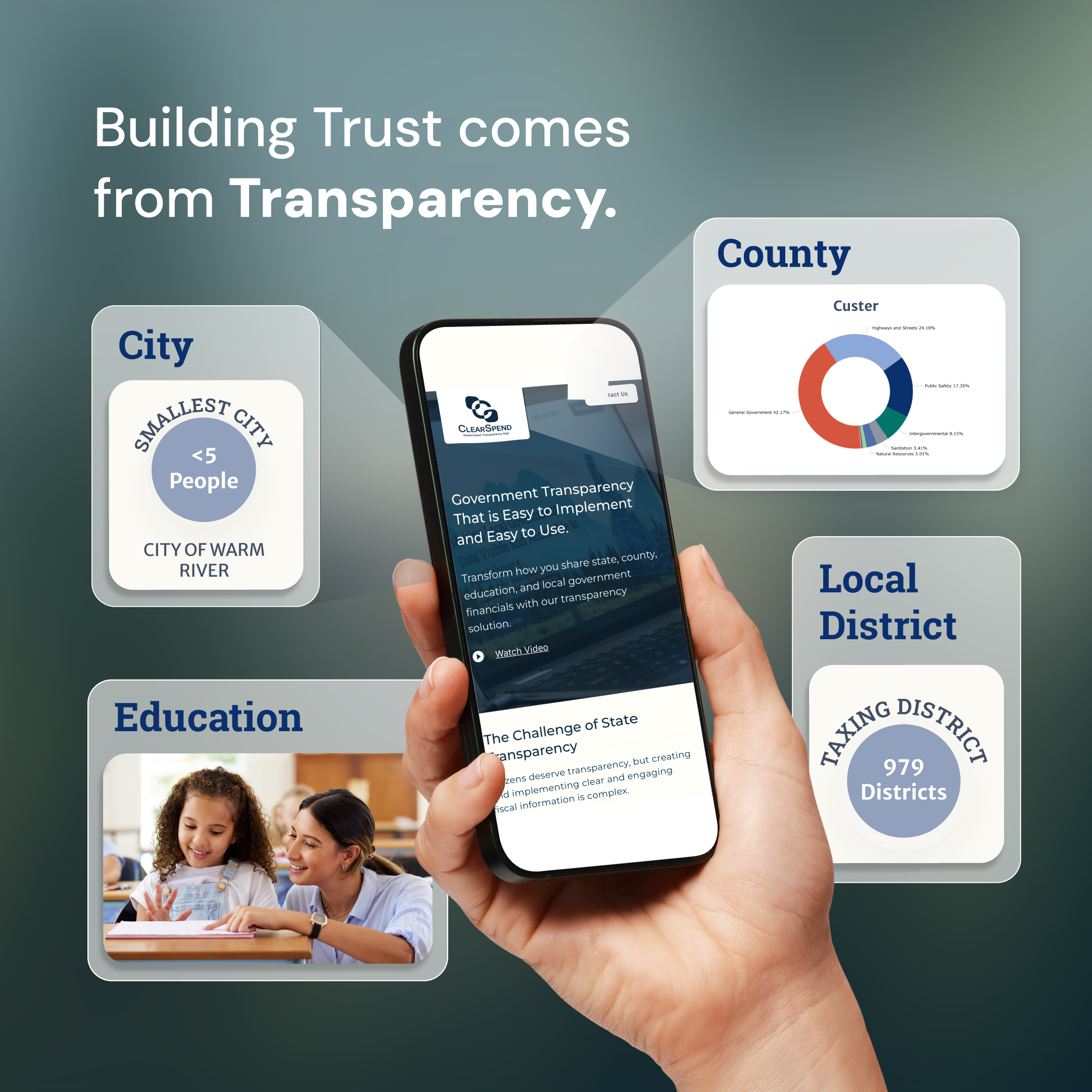
Marketing Materials
Google Display Ads
We chose to run Google Display ads instead of Meta because our target audience was highly specific and required a more selective approach. We also ran LinkedIn ads, limited to direct inbox messages, which did not require any design work.
Testing Message Copy and Imagery
VERSION A
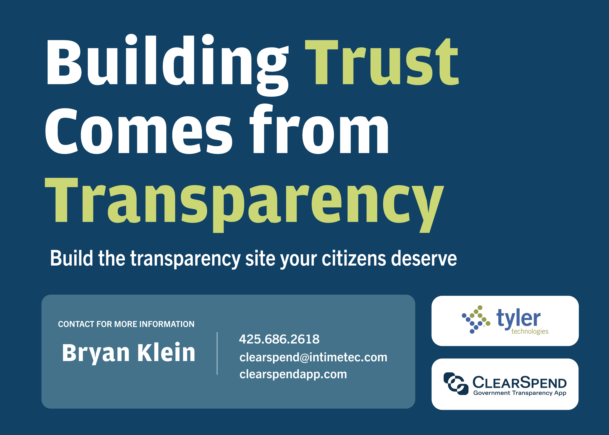
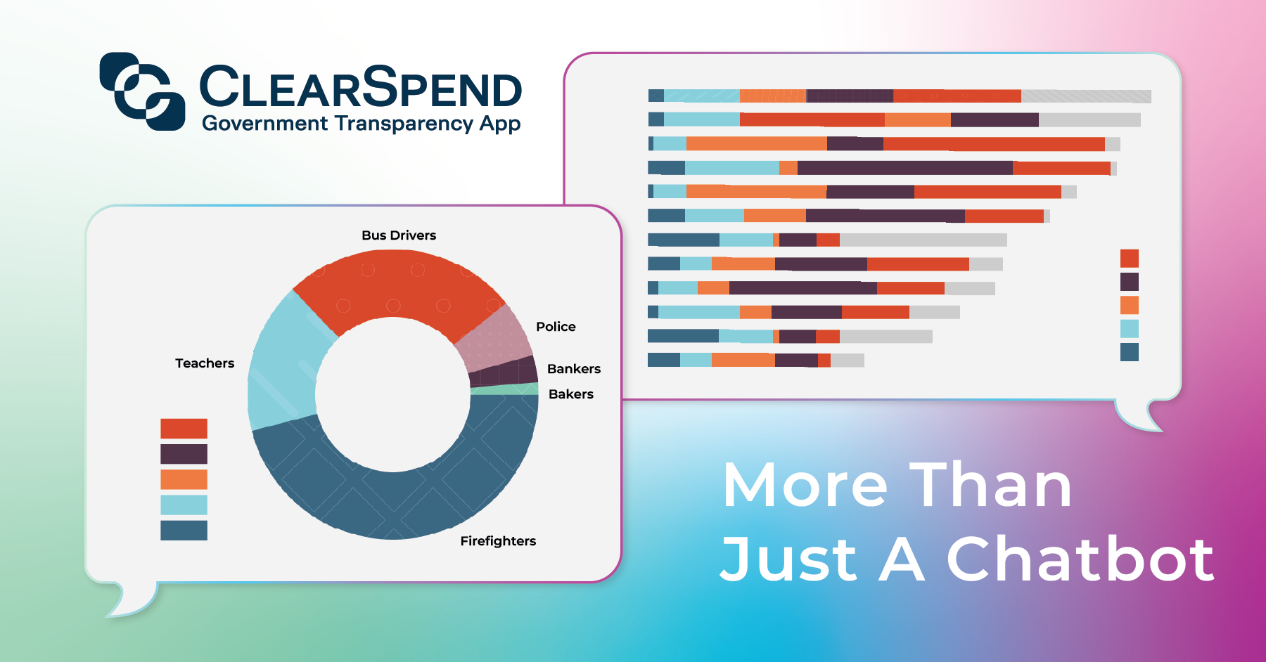
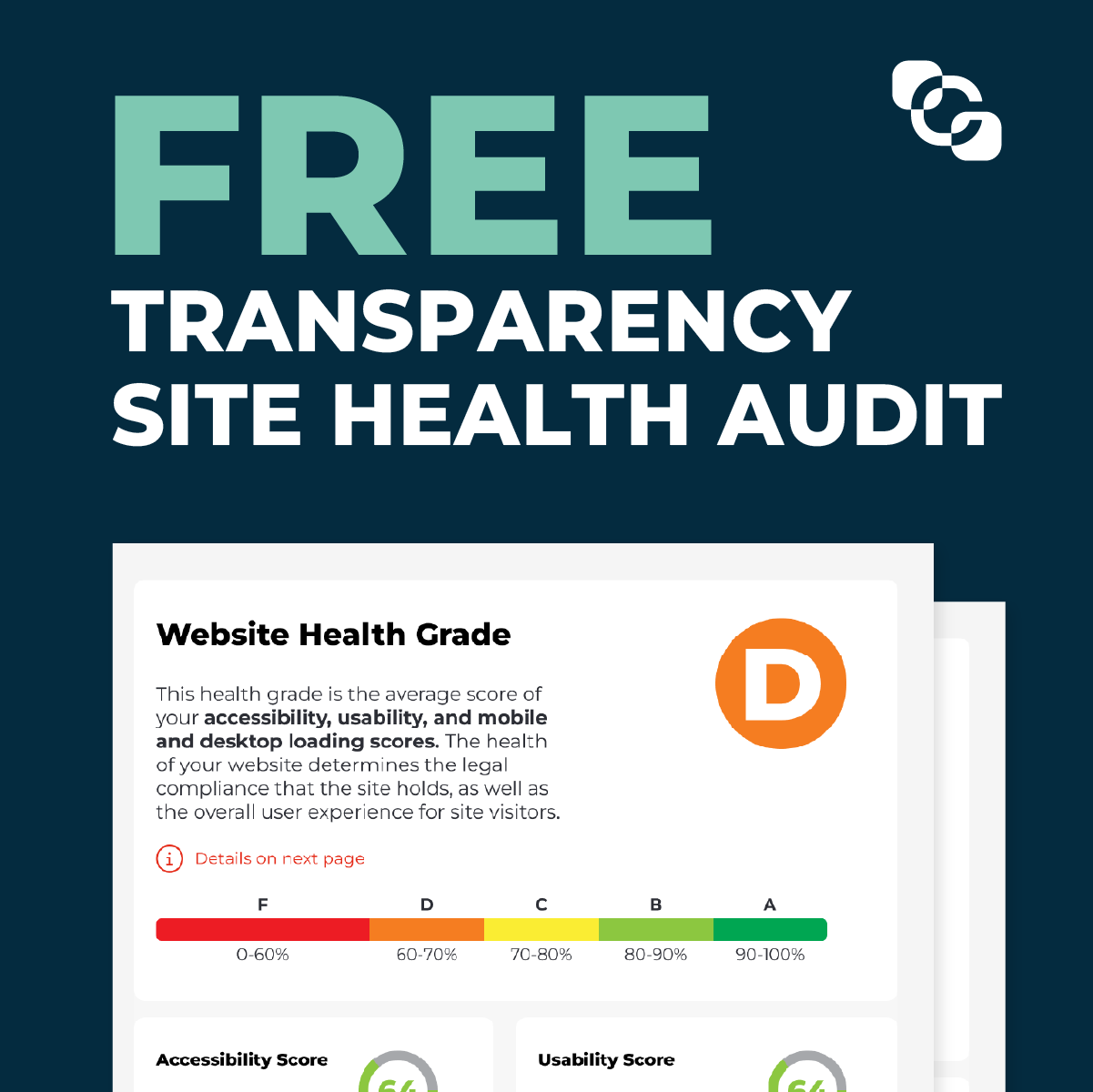
In collaboration with the global content strategist and product owner, I helped develop a series of campaigns aimed at citizens and legislators across multiple states. This campaign focused on increasing awareness of the platform and introducing our new AI chatbot. The audience included State Auditors, Comptrollers, and Treasurers who were familiar with the terminology but new to our software. It ran nationally for a month and then was geotargeted to the location of an event for the week the event was held.


VERSION A
VERSION B
VERSION A
VERSION B
VERSION B

This ad was tested only for messaging outside of the graphic.

Each ad was designed in square, horizontal, and vertical formats to adjust appropriately for each placement. Below is one version of the final design. All ads were A/B tested to refine the ad copy, messaging, and visuals for stronger engagement.
The winning ad is highlighted in blue below.


VERSION A
VERSION B
VERSION A
VERSION B
Informational Postcard
To complement the digital ads, I designed an informational postcard to be distributed at the tradeshow booth. The front summarizes the software’s main features and how they address key pain points for legislators, while also providing general information about the platform. The back highlights the new AI tool and connects it to the broader campaign theme.
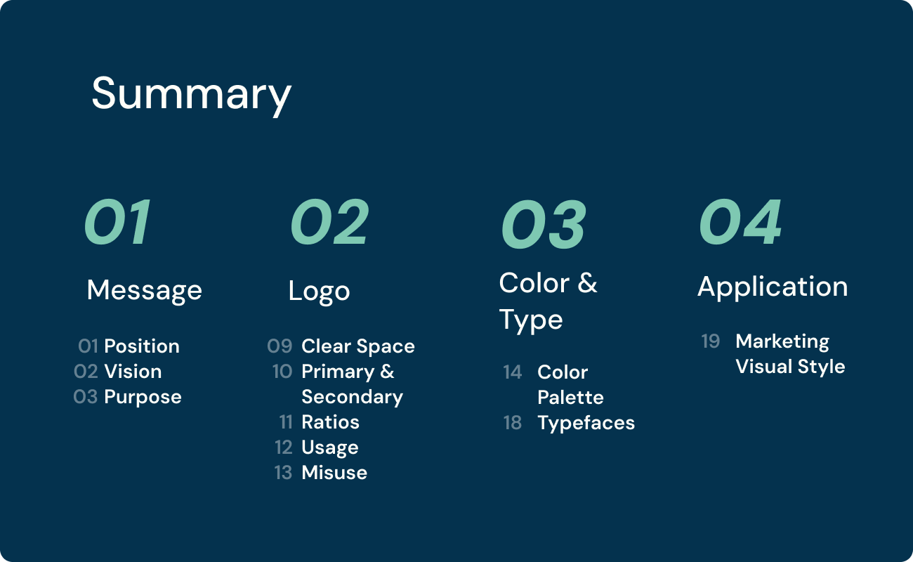
Brand Guide
This was a new product and brand launch, requiring a brand guide to enforce consistency across marketing and UX/UI teams. For this brand, it was especially important to limit the use of the accent color, which was communicated clearly through both guidelines and visual examples.
Due to the sensitivity of the content, only select slides are shown.