Research & Audit
Cartos Suite, a Managed Print Services company

Project Type
Marketing Research
Brand Audit
Branding
Research
Cartos MPS had been established for several years, and had a few industry-known customers, but they were looking to expand to new clients and explore other ways of approaching the industry.
I used several methods of strategic marketing research to audit their business, including value proposition canvases, competitor analysis, and user personas.
Competitor Analysis
-
Providers are focusing on offering tiered service plans for businesses of varying sizes.
Most providers emphasize remote support and on-site repairs to minimize downtime.
Integration with third-party software is an area for potential improvement across several providers.
There is a shift towards more eco-friendly practices in the MPS market.
MPS providers in the market offer a range of services, but each differs in areas such as pricing, flexibility, and support.
-
Limited integration with third-party software among many providers, which could hinder workflow automation.
Brand-specific hardware requirements that reduce flexibility for businesses using multiple printer brands.
Some providers face competition pressures as the MPS market grows, particularly from well-established brands.
Economic fluctuations could negatively impact businesses' investment in managed print services.
-
Contracts with government agencies or in the public sector
Enhanced security features in MPS could attract security-conscious customers.
Cloud service integrations offer more appealing solutions for businesses shifting to cloud-based solutions.
-
Intense competition within the MPS market could impact market share, especially from well-established players.
Rapid technological advancements could challenge providers to stay up-to-date with new solutions.
Economic downturns may lead businesses to reduce spending on managed print services.
Below is a breakdown of the competitor analysis completed. This information was synthesized from competitors websites, reviews left about others’ products, and patterns seen in offerings throughout the managed print industry.
I have kept the companies anonymous for this section to preserve client confidentiality. If you would like to speak about my research in more depth, please reach out.
-
Smaller providers often focus on tailored, cost-effective solutions for specific business needs.
They may offer more personalized customer service but lack the extensive features of larger providers.
Smaller businesses may struggle with the lack of integration with third-party software and fewer eco-friendly options.
They can compete by offering more agile services at a competitive price point.
-
There are major players with a strong global recognition and large-scale service offerings established in the field.
These providers focus on enterprise-level solutions and offer flexible service plans and robust customer support.
However, they may face limitations in integrating with third-party software, and their pricing structures can be complex.
Larger businesses value strong security, remote monitoring, and responsive on-site support.
-
Cloud-based printing & subscription models.
Convergence with managed IT services.
AI & analytics for smarter print workflows.
Green initiatives and sustainability.
Hybrid work solutions: mobile, secure, remote printing.
-
The MPS market is evolving with a clear trend towards tiered service plans, and better customer support.
There is a growing opportunity for providers to enhance security, expand into smaller markets, and integrate with cloud services.
Major threats include increased competition, economic uncertainty, and the challenge of keeping up with technological change.
Both large and small providers have unique strengths, with larger companies offering more extensive services, while smaller companies offer flexibility and tailored solutions.
Value Proposition Canvases
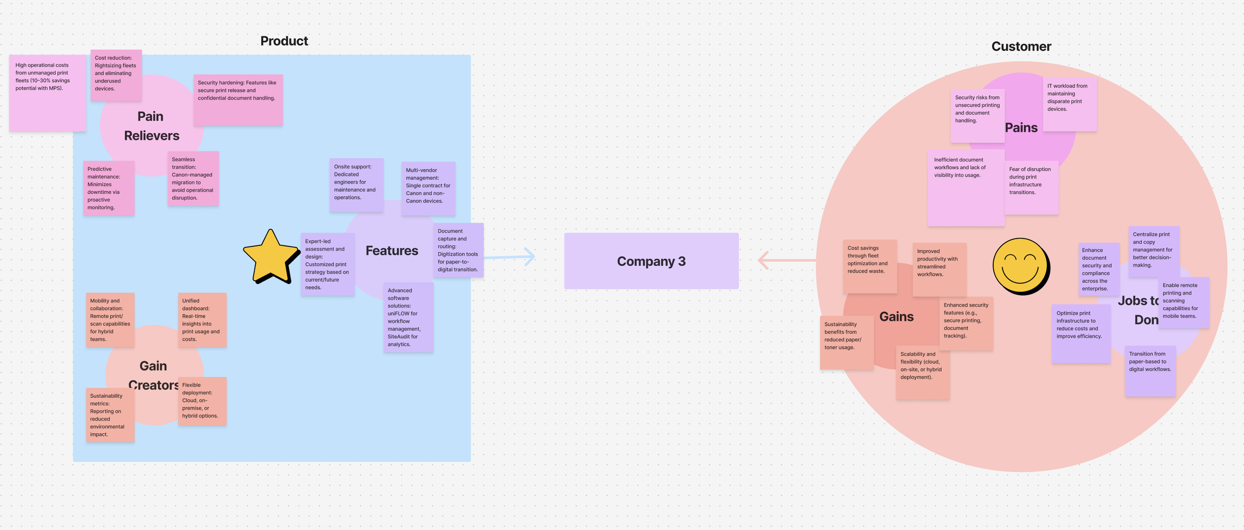
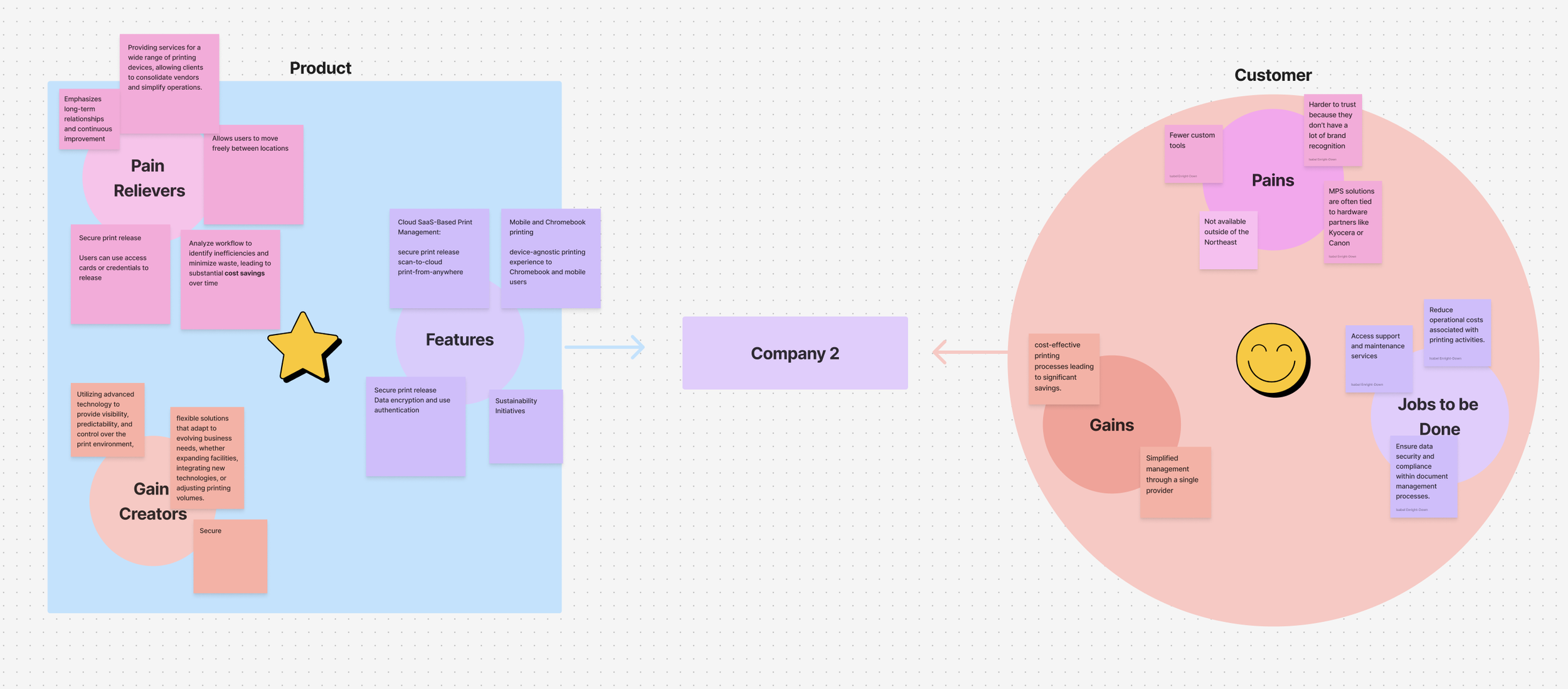
These canvases helped to align Cartos' offerings with the real needs and challenges of its users, ensuring the brand delivers meaningful value. I created a canvas for 3 competitors to understand their customer gains and pain points. This analysis highlighted opportunities where Cartos could step in and outperform the competition.

User Persona
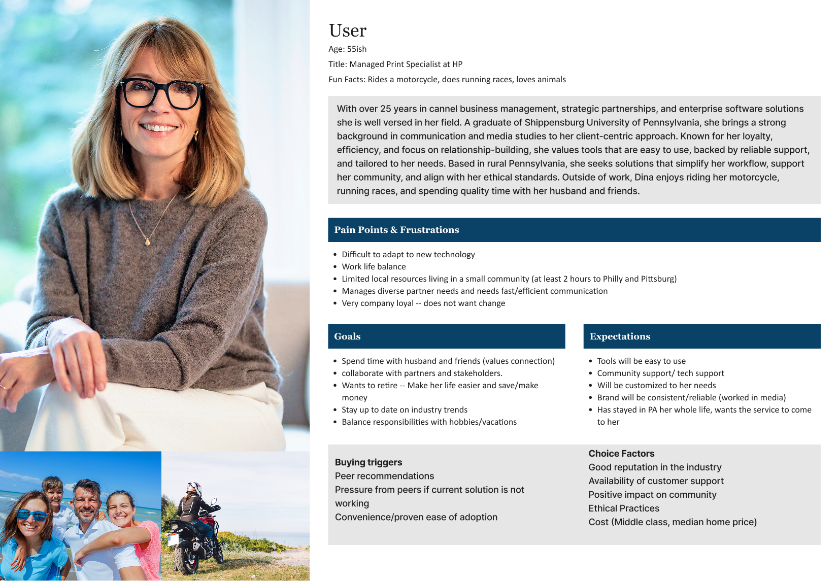
Based on a real customer, this user persona helped identify the target audience’s needs, behaviors, and goals. It brings a human-centered aspect to the process and creates a reference for whom we are assisting while developing the brand. This customer was selected because of the similarities she had to other customers of the product.
Logo Creation
Following the research, I conducted a brand sprint to better understand the ideal positioning for the brand.
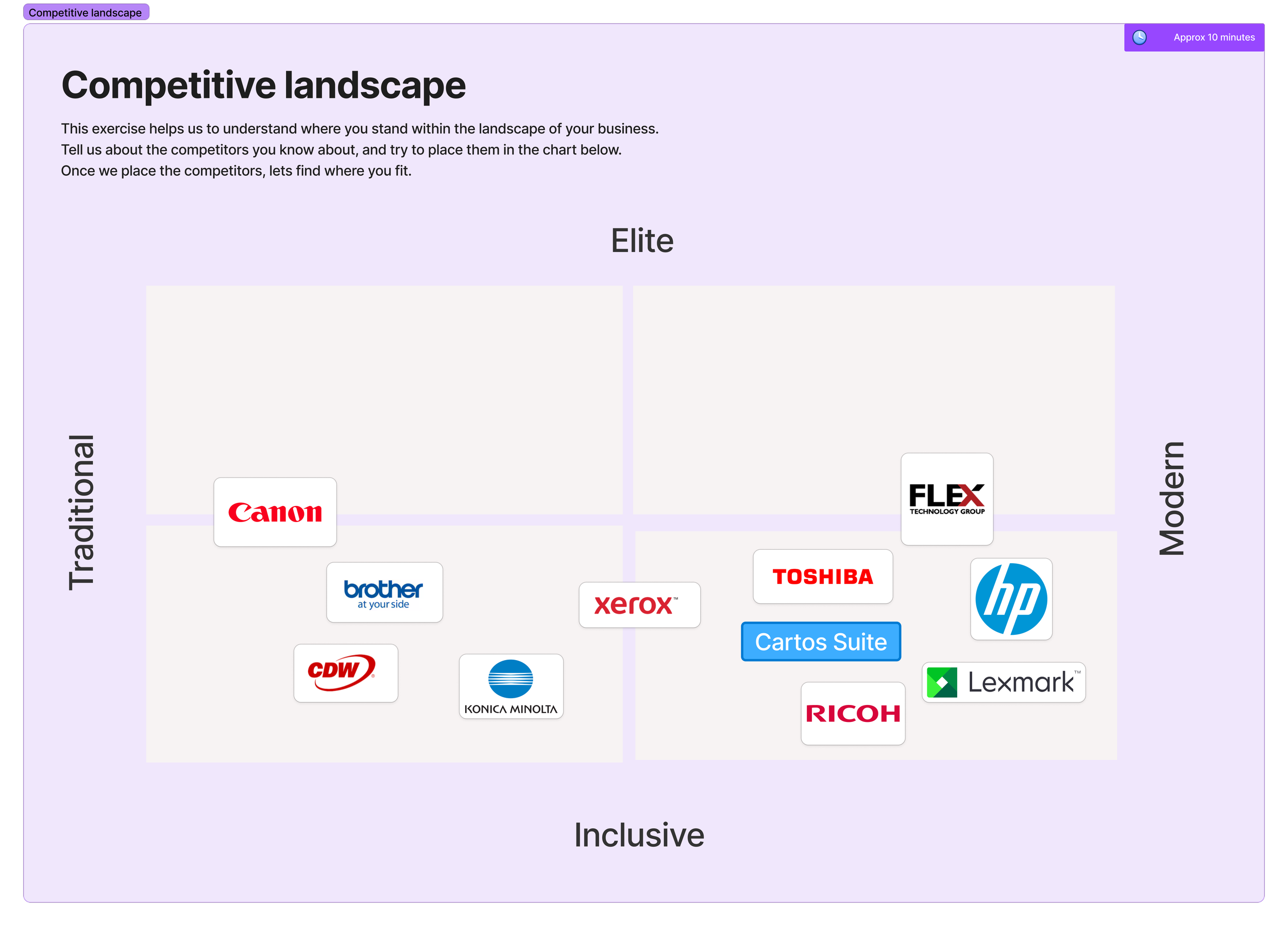
The sprint began by outlining Cartos’ offerings and defining what the company provides. From there, we explored the competitive landscape to identify which brands Cartos should align with and how to differentiate within the market. These decisions were informed by the earlier research. The final section focused on defining the core terms that best express the brand’s vision.
First Iterations
The first round of logo concepts incorporated an arrow for forward movement, a folded paper corner to reflect how the application keeps tabs on printing needs, and a 'C' to represent Cartos.

Final Direction

The final logo combines an ink drop with a location pin to represent how the system ensures printing happens smoothly and in the right place. The pin also nods to the application's mapping function, which locates and monitors every printer in the building.





Branding
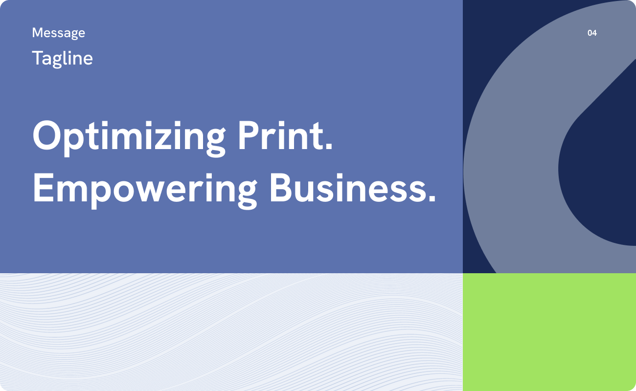
In addition to the logo a full brand was created including typography, colors, messaging,
patterns and a photography style.
The slides below were created by an intern I mentored for the brand guide creation process.