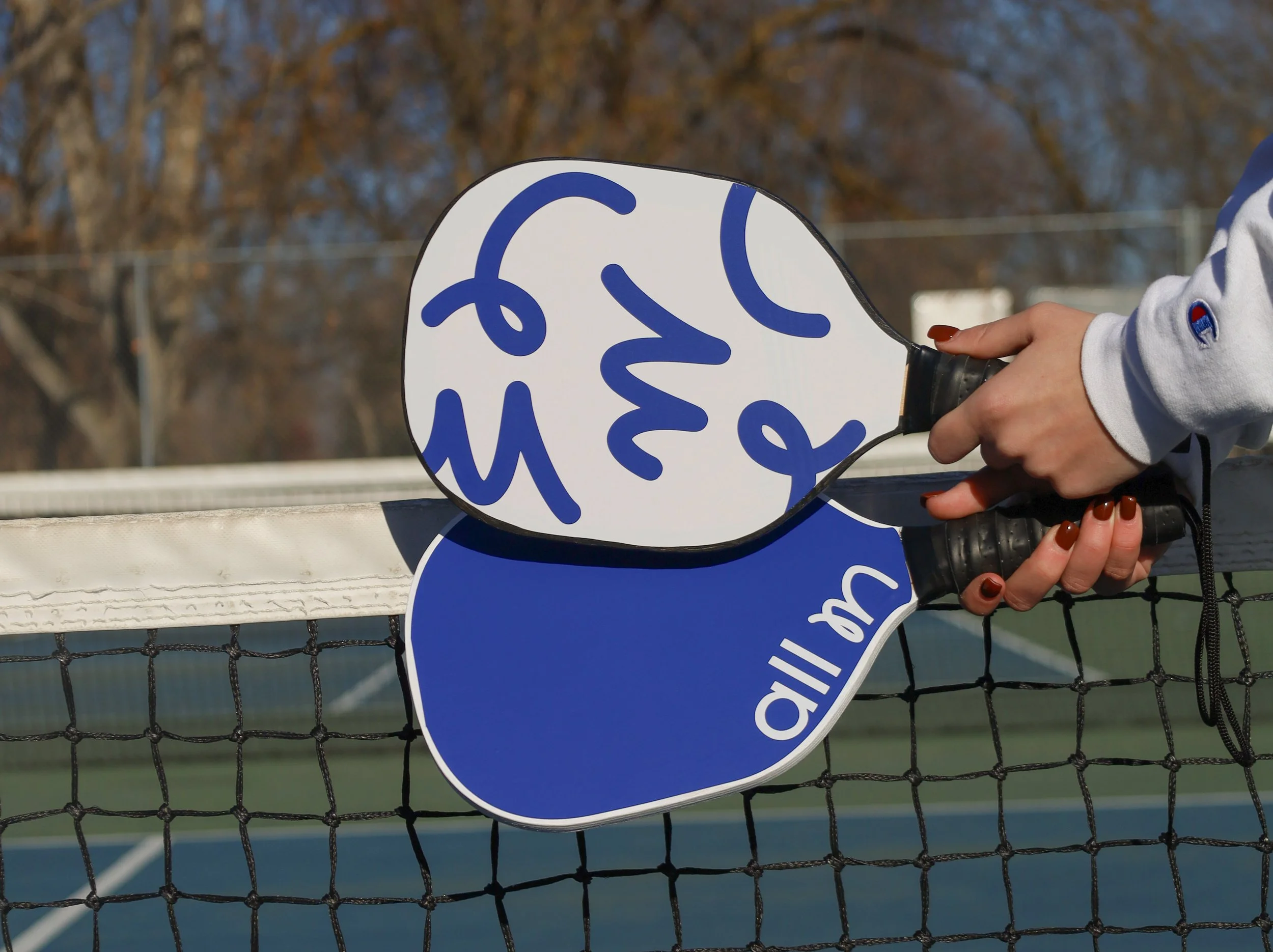
All In
This self-initiated project was created to expand my experience in packaging design and explore how a brand identity can translate into a cohesive physical experience. The project allowed me to take a concept from initial research and visual exploration through to a complete packaging system, considering both the visual and physical experience of the product.
Project Type
Package Design
Branding

The Brand
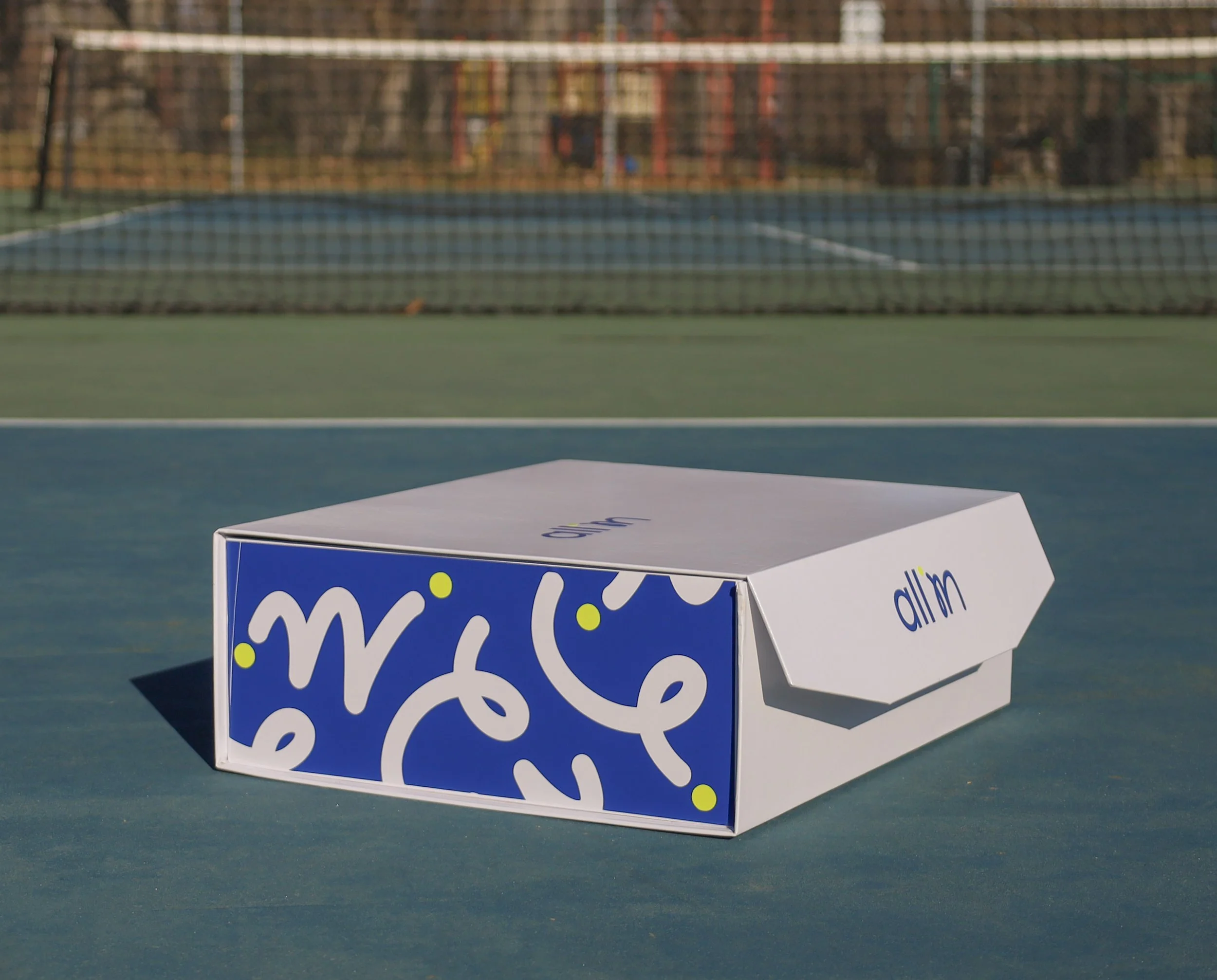
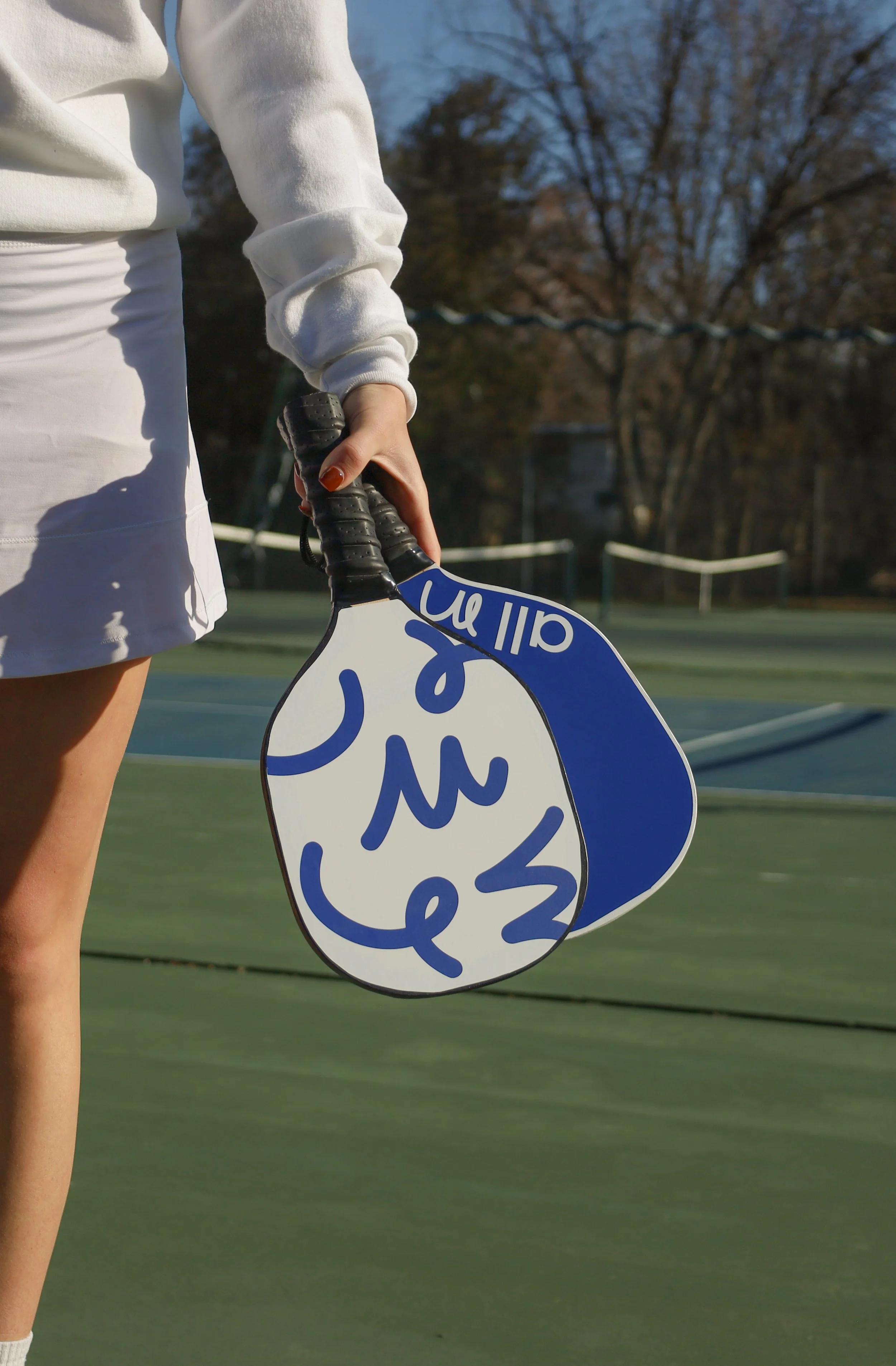
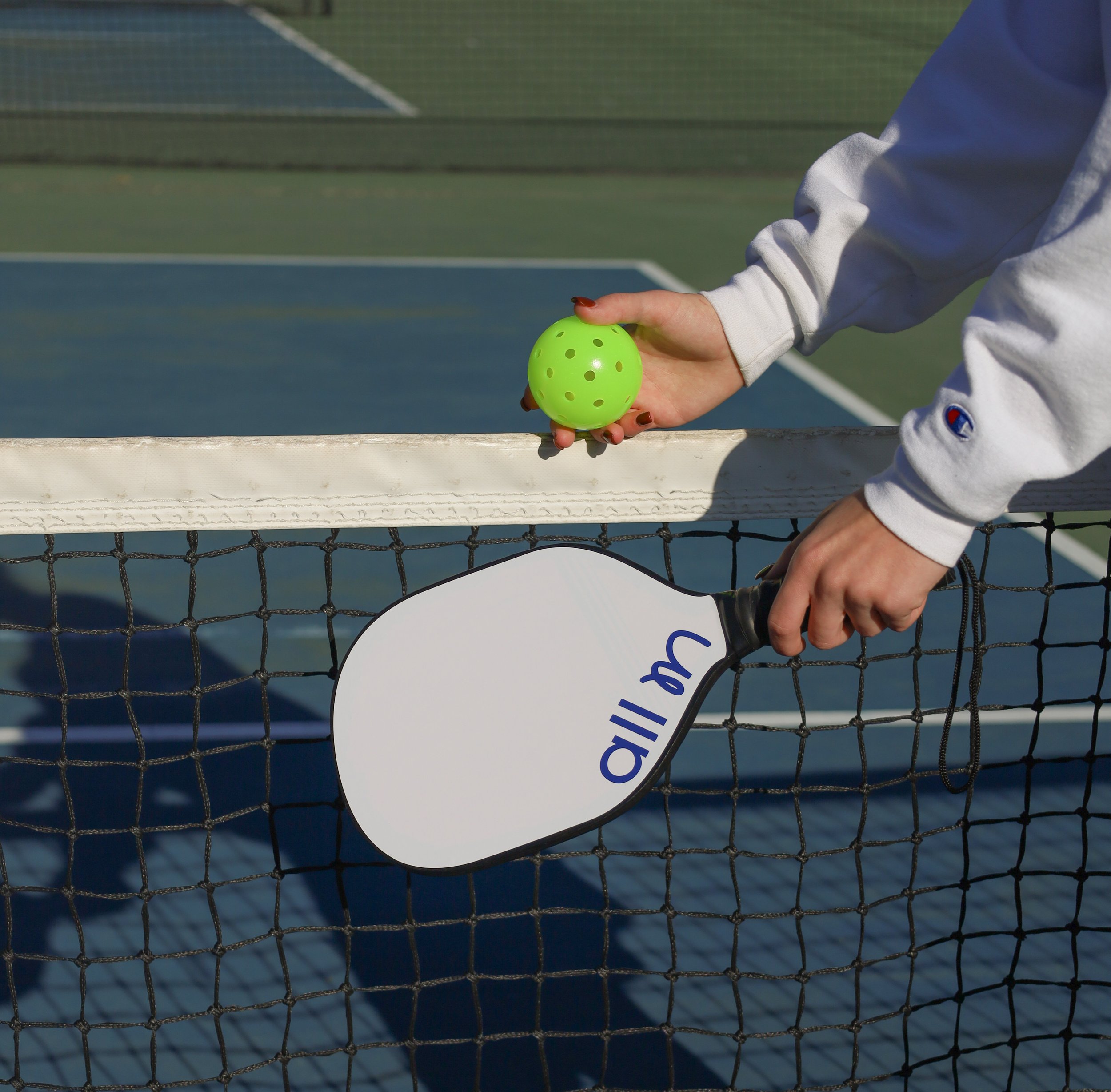
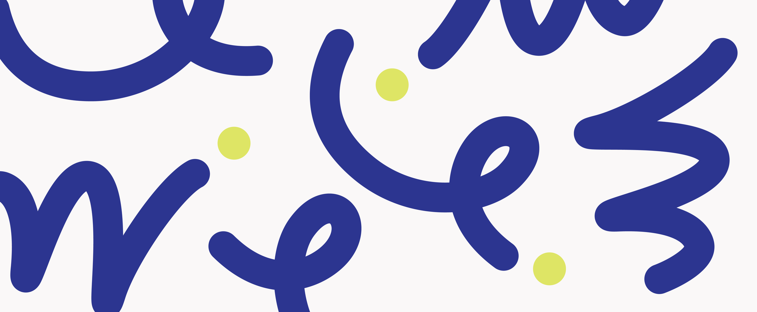
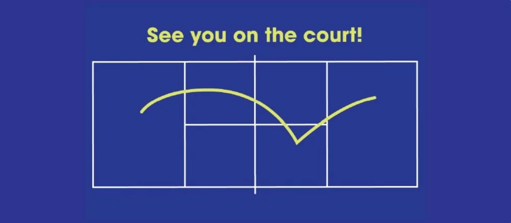
The color palette draws from the familiar colors of a pickleball court and the bright yellow ball, creating an immediate connection to the sport while capturing its fun, social, and energetic nature. The playful line mimics the movement of a bouncing ball across the court, while the bold color combination helps the packaging stand out on the shelf and catch the attention of shoppers.

Process & Materials
Designing for a physical object introduced considerations that aren't present in traditional screen-based design.
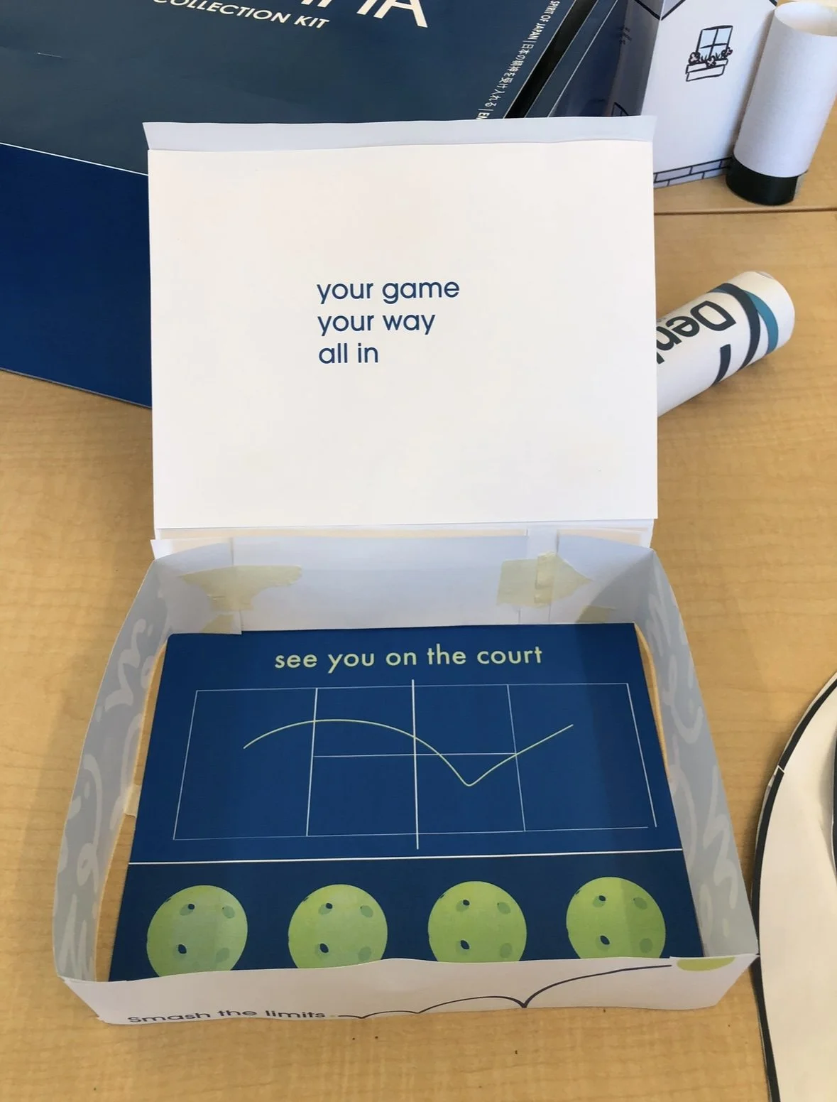
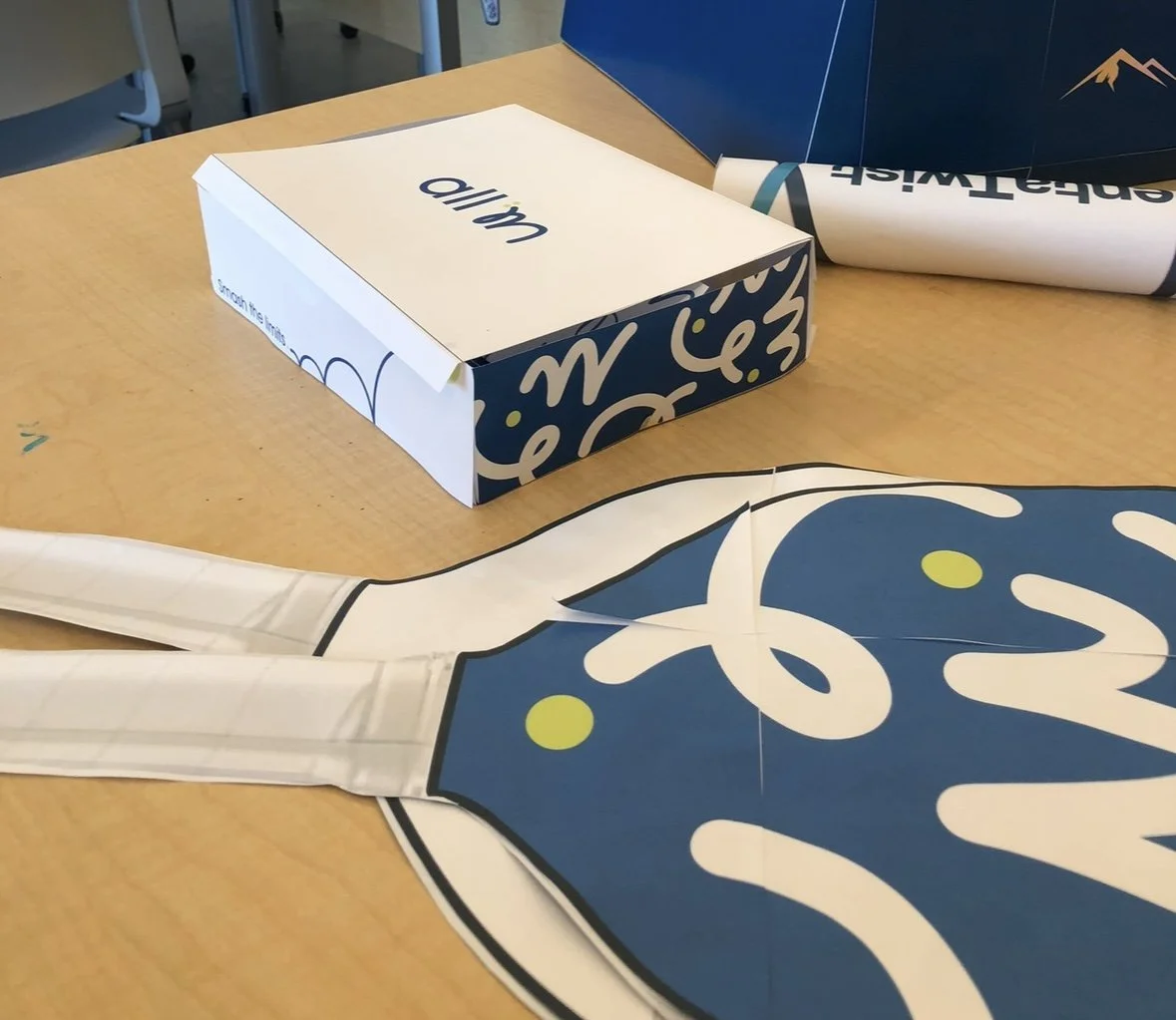
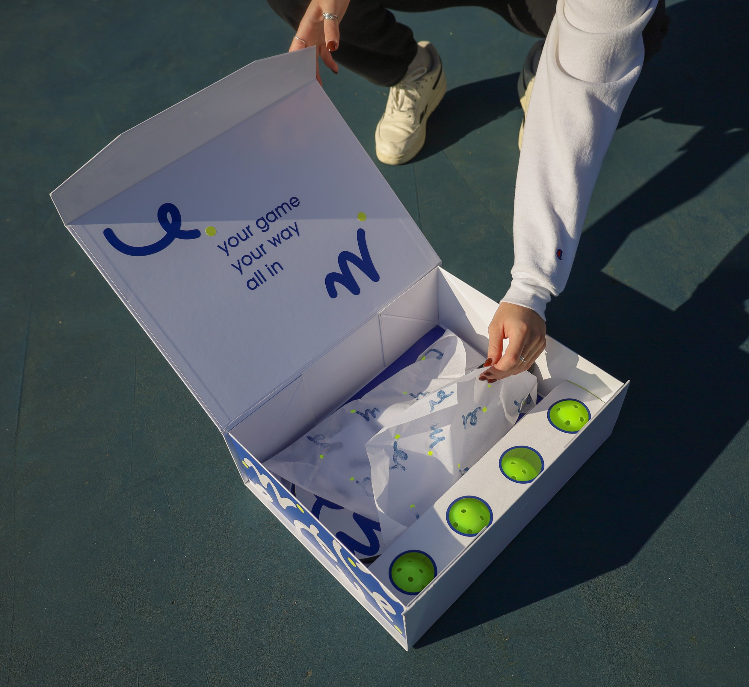
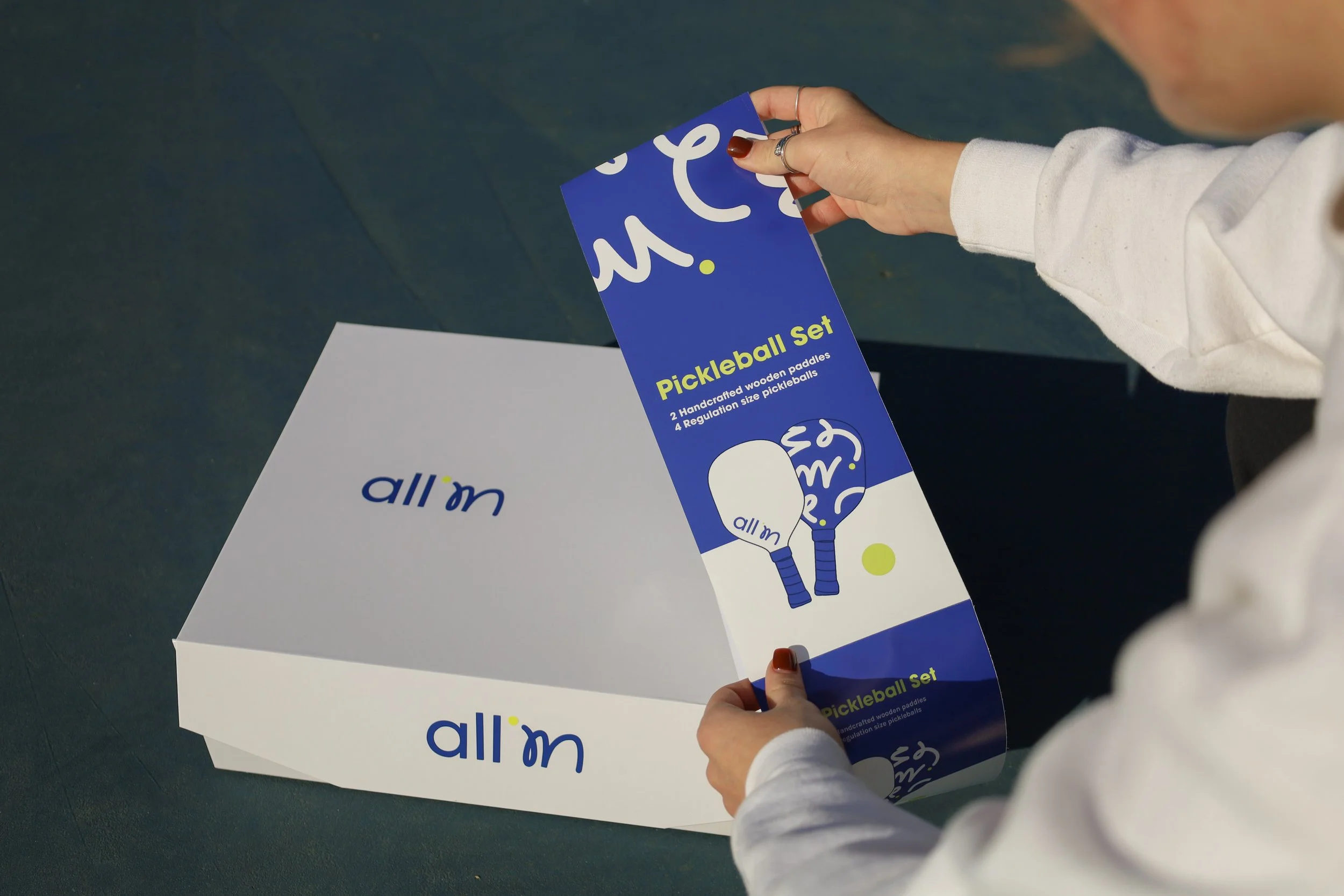
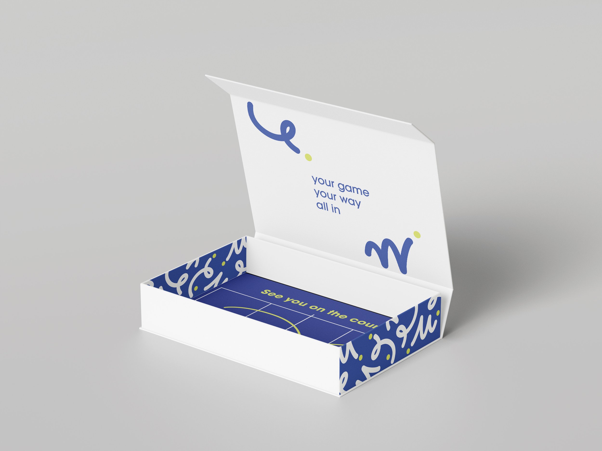
I considered how the customer would encounter the package from different angles, how information would be discovered, and how the sequence of opening and interacting with the packaging could contribute to the overall experience.
This helped shape decisions around placement, scale, hierarchy, structure, and messaging, ensuring the design worked not only as a flat composition but as a three-dimensional experience.
Final
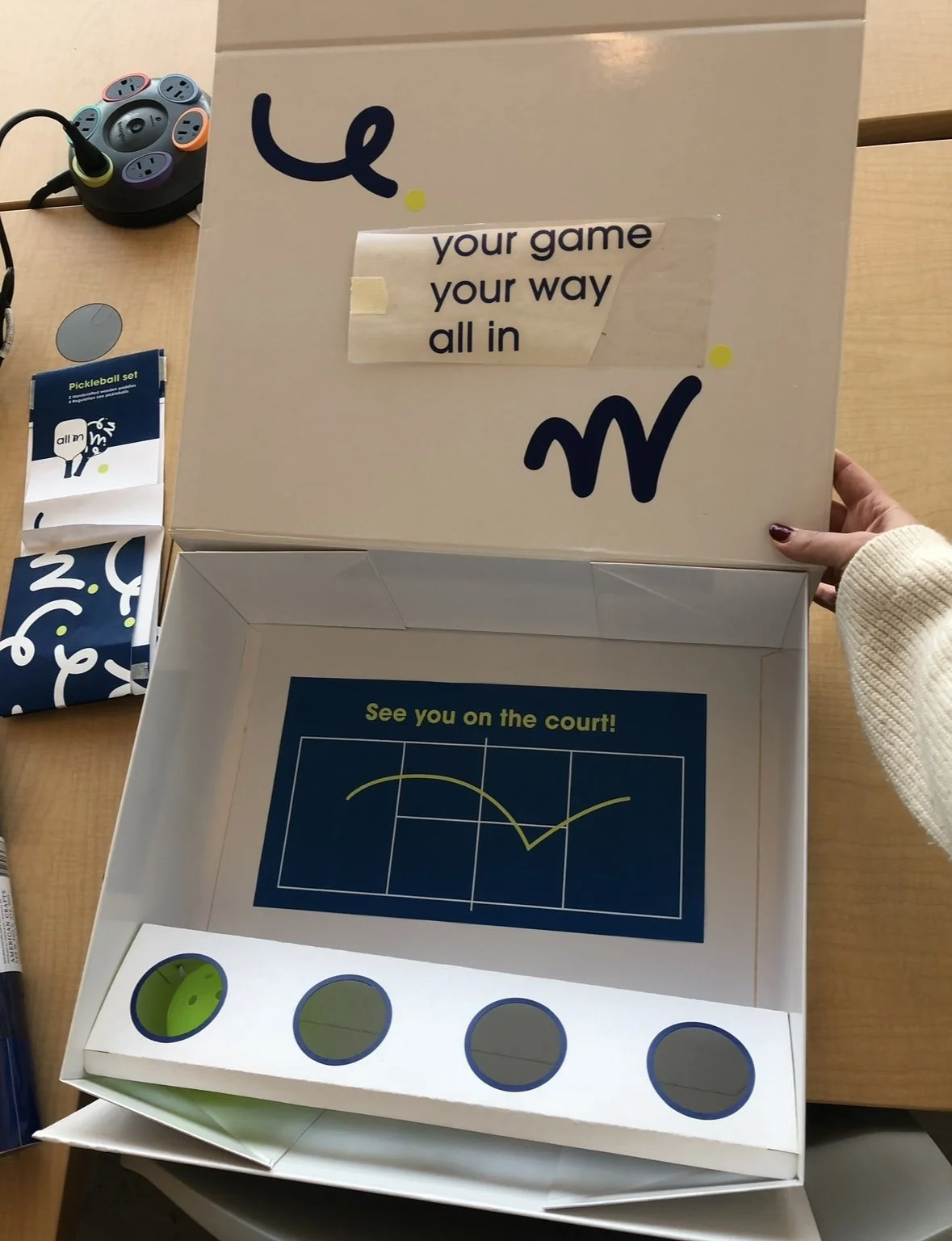
The final packaging system included a box with custom interior and exterior graphics, a ball holder, paddles, and custom tissue paper. Adhesive vinyl was used for the exterior box graphics and paddle designs, while the ball holder was laser-cut from poster board to securely hold the balls and attach to the box.
This project expanded my experience with packaging design and strengthened my ability to think about how a brand can exist consistently across different environments and customer touchpoints.